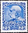
1908 PRINTING (Mi:AT 147v):
The 1908 printing on chalk coated paper is generally much sharper and clearer。 The words “FRANCISCUS JOSEPHUS I” beside the portrait appear to be written in white letters and are clear。 The ink did not absorb into the shiny coated paper。 Therefore if you view the stamp under magnification the colour in the inked sections is deeper blue, a bit uneven (as if in blobs), and a lighter coloured fine boarder line is visible around each inked section。 The stamp’s overall appearance is brighter (less dull) than the 1913 printing.
1913 PRINTING (Mi:AT 147x):
The 1913 printing on regular paper is not so sharp and clear。 The words “FRANCISCUS JOSEPHUS I” beside the portrait are faint。 The ink absorbed more easily into the regular paper used in 1913 giving the overall stamp a darker appearance。 Under magnification the inked sections are lighter (more grayish) and are more evenly coloured throughout 。 The stamp’s overall colour is duller and slightly more grayish than the 1908 printing。